📘 Best Practices: Designing Pages
Think of Pages as your bulletin board, and Cards and Collections (or other sources) as your filing cabinet.
Pages are for showcasing important, timely content where people will see it. Use them to highlight what's new, what's urgent, or what your team needs right now. Cards and Collections are where knowledge lives long-term in an organized, searchable structure.
Great Pages balance visual appeal with easy navigation. Follow these principles to create Pages that users actually want to visit.
Access RequiredOnly Guru Admins, Page Owners, and relevantcustom roles can edit the main workspace homepage.
Admins, Creators, and relevant custom roles can also:
- Create additional Pages
- Assign Page Owners
- Control who can edit or view each Page
Visual Hierarchy & Layout
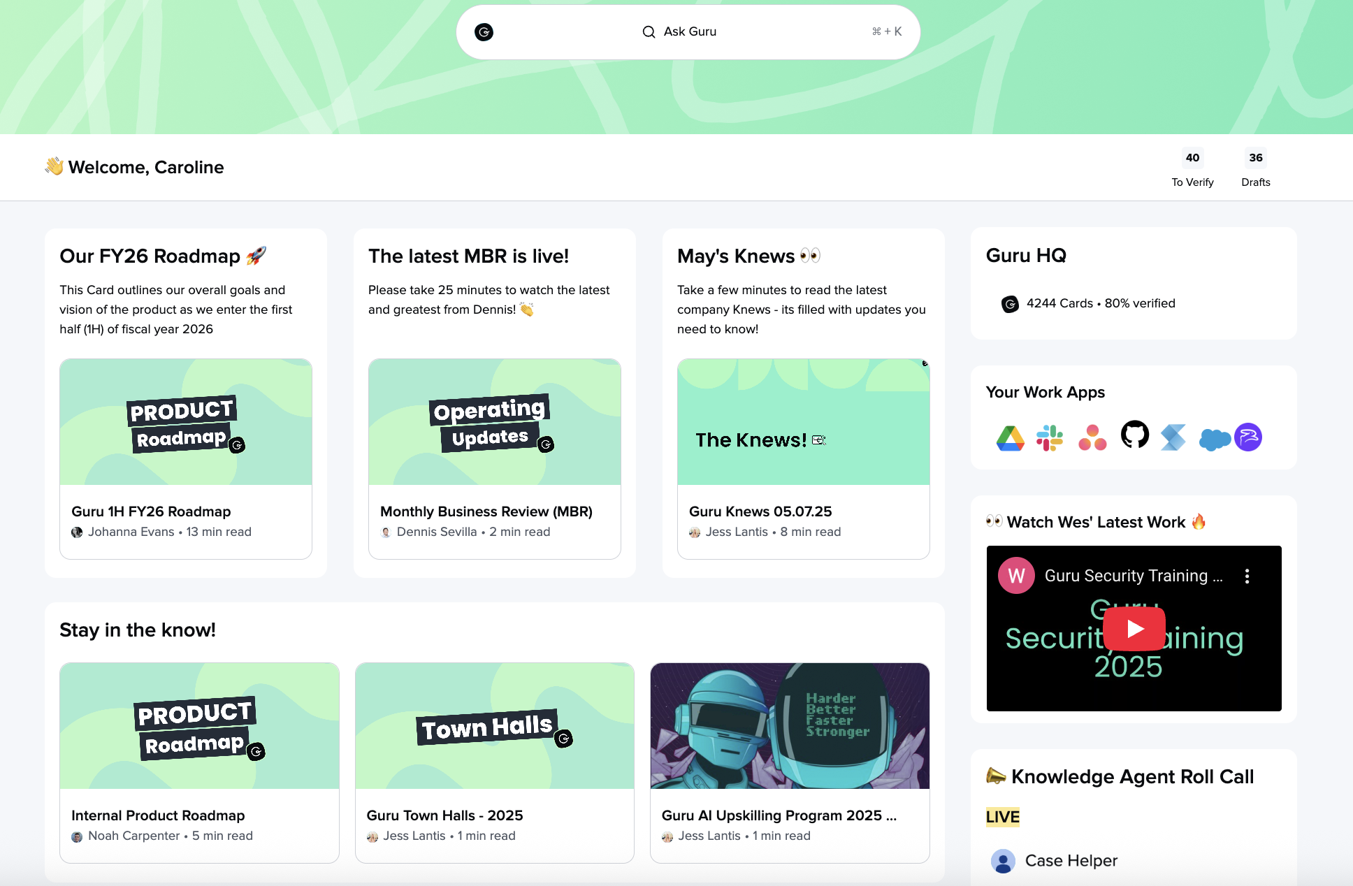
Use the rule of three
Arrange content boxes in groups of three for natural visual balance. This creates rhythm and makes scanning easier.
Lead with visuals
Place images at the top of sections, before headers or text. This draws attention and establishes context immediately.
Size images correctly
- Header images: 1600px wide × 400-600px tall
- Content images: 140px wide × 210px tall
Consistent sizing ensures your Page loads quickly and looks professional.
Maintain consistent sizing
Keep text blocks and box heights similar across each section. Uneven layouts look unfinished and distract from your content.
Headers & Structure
Create clear levels of information
- H1/H2 for major sections and page divisions
- H3 for individual cards, boxes, or sub-topics
- Avoid jumping levels (don't go from H1 to H3)
This hierarchy helps users scan and navigate quickly.
Content & Links
Make links actionable
Instead of "Click here," link the descriptive phrase itself: "Download the sales enablement template" or "See Q1 product updates."
Link images when relevant
If an image represents a resource or destination, make the entire image clickable rather than adding a separate text link.
Simplify formatting
Excessive colors, italics, and underlines create visual noise. Use bold sparingly for emphasis and stick to your brand colors.
Creating Header Images
Keep text minimal: If adding text to header images, ensure high contrast and readability
Brand consistently: Use similar styles across all your organization's Pages
📖 See detailed guidance: Header images for Pages
Getting Started
Download starter assets: Header images and icons to jump-start your first Page
Sample Content for Pages
Here is a public Card where you can download some sample header images, and icons for your page.
Page Templates
Check out this community post for ✨inspiration ✨from other Guru customers!
Want a closer look at some key Guru features and best practices?Check out our events page for demos, workshops, new release roundups, Getting Started bootcamp, guest panelists and more! For upcoming live events and a series of past recordings: Click here to register
Updated 3 months ago